Welcome to our guide on the psychology of colour and how it can be used to effectively manipulate emotions through your website. Understanding the impact of colours on human emotions and behaviour is crucial in designing a website that engages users and elicits specific emotional responses. By strategically applying colour psychology principles to your web design, you can create a memorable user experience, achieve website goals, and influence conversions.
Key Takeaways:
- Colour psychology plays a vital role in eliciting specific emotional responses from website visitors.
- Warm tones like red and orange evoke passion and energy, while cool tones like blue and green create a sense of calmness and relaxation.
- Colour symbolism and cultural influences impact the interpretation and meaning of colours in web design.
- Consistency in colour usage enhances brand recognition and helps websites stand out from the competition.
- Understanding your target audience’s colour preferences is crucial for creating an emotionally resonant website.
An Introduction to Colour Psychology in Web Design
Welcome to the fascinating world of colour psychology in web design! In this section, we will explore the concept of colour psychology and its relevance to creating visually captivating and emotionally engaging websites. Understanding how colours can affect human emotions and behaviour is crucial for designing a website that resonates with your audience and delivers an exceptional user experience.
Colour psychology is the study of how colours can influence our emotions, attitudes, and behaviours. When it comes to web design, using colours strategically can evoke specific emotions and enhance user engagement. By carefully selecting and combining colours, you can create a visually harmonious and impactful website that captures the attention of your visitors.
Colour plays a vital role in creating a positive user experience. Different colours can evoke a wide range of emotions. For example, warm colours like red and orange tend to elicit feelings of excitement, passion, and energy, while cool colours like blue and green evoke a sense of serenity, calmness, and trust.
As a web designer, it’s crucial to consider the emotional response you want to elicit from your users. By aligning colours with your brand identity and understanding your target audience’s preferences, you can create a visually appealing website that resonates on an emotional level.
Colour symbolism and cultural influences also play a significant role in web design. Different cultures may associate specific colours with different meanings. Therefore, it is vital to consider the cultural context and ensure universal usability in your colour choices.
Let’s take a closer look at some of the key principles and theories of colour psychology that every web designer should be aware of:
| Principle/Theory | Description |
|---|---|
| The Colour Wheel | Understanding the relationships between primary, secondary, and tertiary colours and how they can be used to create harmonious colour schemes. |
| Contrast | Exploring the use of contrasting colours to draw attention, create hierarchy, and improve readability. |
| Colour Associations | Examining the meanings and cultural associations of different colours and how they can be interpreted in web design. |
| Colour Psychology in Marketing | Understanding how colours can influence consumer behaviour and purchasing decisions. |
By incorporating these principles and theories into your web design process, you can create a visually stunning and emotionally impactful website that captivates your audience and enhances user experience.
In the next sections, we will dive deeper into the language of colour, explore how different colours affect mood, discuss colour symbolism, and provide practical tips for creating a user-friendly website environment. Get ready to uncover the psychological power of colour in web design!
Decoding the Language of Colour: How Colours Affect Mood
In this section, we will delve deeper into the language of colour and explore how different colours can affect mood. By understanding colour psychology, web designers can strategically use colours to evoke specific emotional responses and create a more engaging user experience.
The Influence of Warm and Cool Tones
Colour tones play a significant role in shaping our emotional state. Warm tones, such as red, orange, and yellow, are associated with energy, passion, and enthusiasm. These colours can evoke feelings of excitement and positivity, making them ideal for call-to-action buttons or areas that require attention.
On the other hand, cool tones like blue, green, and purple have a calming effect and can create a sense of serenity and relaxation. These colours are often used in areas where users need to feel at ease or make a thoughtful decision. For example, blue is commonly used in finance or healthcare websites to instill trust and reliability.
Interpreting Colour Meanings
Colours have symbolic meanings and associations that can vary based on cultural contexts. Understanding these interpretations can help web designers effectively communicate messages and evoke desired emotional responses.
For instance, red is often associated with power, urgency, and passion, while green is symbolized as nature, growth, and harmony. Yellow represents warmth, happiness, and optimism, while purple signifies luxury, creativity, and spirituality.
It is important to align colour choices with a website’s purpose and target audience to ensure the intended meaning is conveyed. Conducting thorough research and considering cultural nuances can help ensure the chosen colours resonate with the desired audience.
| Colour | Meaning |
|---|---|
| Red | Power, urgency, passion |
| Green | Nature, growth, harmony |
| Yellow | Warmth, happiness, optimism |
| Purple | Luxury, creativity, spirituality |
The Psychology of Colours
In this section, we will delve into the psychology of colours and how they can impact human emotions and behaviour. Colours have the power to elicit specific emotional responses and shape user perceptions. Understanding the colour perception and its effect on our emotional response is key to creating a successful website that engages users and drives desired actions.
The human brain has a complex relationship with colours. Different colours can trigger various psychological and physiological effects. For example, warm colours such as red and orange are often associated with excitement and passion, while cool colours such as blue and green are known to promote calmness and relaxation.
“Colours are a kind of context, they set the tone for experience.” – Richard Meier
Colour psychology plays a crucial role in influencing decision-making and user engagement on a website. By strategically selecting and implementing colours, web designers can create a visually appealing and emotionally resonant experience that aligns with the goals of the website. Whether it’s encouraging users to make a purchase, sign up for a newsletter, or engage with content, the use of colours can significantly impact user behaviour.
The Impact of Colour on Behaviour
Colours have been found to have a direct impact on our behaviour and can influence our mood, attention span, and perception. For example, studies have shown that yellow can evoke feelings of happiness and positivity, making it an ideal choice for brands aiming to create a sense of optimism and energy.
Similarly, the colour red has been associated with high levels of arousal and can stimulate appetite, making it a popular choice for food-related industries. On the other hand, blue has a calming effect and is often used by brands looking to create a sense of trust and reliability.
Creating an Emotional Connection with Colours
When selecting colours for a website, it’s important to consider the emotional connection they can create with the target audience. Different colours may evoke different responses depending on cultural backgrounds, personal experiences, and individual preferences. Understanding the target audience and their emotional associations with colours can help designers create a more impactful and appealing user experience.
Furthermore, colours can be combined and contrasted to create visual harmony and hierarchy on a website. The use of a well-thought-out colour palette can guide users’ attention, highlight important elements, and enhance overall user experience.
| Colour | Emotional Response |
|---|---|
| Red | Excitement, Passion, Energy |
| Blue | Calmness, Trust, Reliability |
| Green | Nature, Harmony, Freshness |
| Yellow | Optimism, Happiness, Warmth |
| Orange | Creativity, Enthusiasm, Vitality |
Understanding the psychology of colours is a valuable tool for web designers. By considering the impact of colours on emotions and behaviour, designers can create websites that not only visually appeal to users but also elicit the desired response and engagement.
Colour Symbolism and Digital Interactions
In the world of web design, colour goes beyond aesthetics. It holds a symbolic power that can evoke emotions, influence perceptions, and create memorable user experiences. Understanding the cultural influences and best practices surrounding colour in digital interactions is crucial for designers and marketers alike.
Tradition and Innovation: Cultural Influences on Colour Perception
Culture plays a significant role in how colours are perceived and interpreted. Different societies and traditions ascribe various meanings to colours, shaping the way they are used in design. For example, while white represents purity and innocence in Western cultures, it symbolizes mourning in many Asian cultures. By considering these cultural influences, designers can craft websites that resonate with specific target audiences and avoid potential misunderstandings or misrepresentations.
“Colours have the power to transcend language and convey meaning universally. By understanding the cultural nuances associated with different colours, designers can create inclusive and engaging digital experiences.”
To create a culturally inclusive website, consider the preferences and symbolism associated with colours in your target audience. Take into account the cultural context, the values and beliefs, and any specific colour symbolism that resonates with the audience. By embracing cultural diversity in colour choices, designers can ensure that their websites foster connections and engage users on a deeper level.
Crafting a Colourful User Experience: Best Practices
When it comes to digital interactions, colour is not just about visuals – it’s about creating a seamless and enjoyable user experience. Here are some best practices to keep in mind:
- Consistency: Maintain a consistent colour palette throughout your website to establish a cohesive visual identity and enhance brand recognition.
- Contrast: Use contrasting colours strategically to highlight important elements, improve legibility, and guide users’ attention.
- Accessibility: Ensure your chosen colours meet accessibility standards, making your website usable for people with visual impairments or color blindness.
- Emotional Impact: Understand the emotional associations of colours and use them intentionally to create the desired mood and evoke specific responses from users.
By adhering to these best practices, you can leverage the power of colour symbolism to create impactful, engaging, and user-friendly websites that leave a lasting impression on your audience.
| Colour Symbolism in Different Cultures | Cultural Colour Associations |
|---|---|
| Red | Good luck (China), love/passion (Western cultures) |
| Yellow | Joy (Western cultures), betrayal (Egypt) |
| Blue | Calmness (Western cultures), sadness (Iran) |
| Black | Mourning (Western cultures), power (Japan) |
Table: Colour Symbolism in Different Cultures
Elevating Brand Presence with Colour Associations
In the world of web design, colour plays a crucial role in establishing brand presence and creating a memorable user experience. Through strategic colour associations, brands can evoke specific emotions, enhance recognition, and stand out from their competitors. In this section, we will explore how colour consistency, brand recognition, and contrast contribute to elevating brand presence in web design.
Colour Consistency and Brand Recognition
Consistency is key when it comes to branding, and this extends to the use of colour. By maintaining a consistent colour palette throughout your website, you can reinforce brand recognition and establish a strong brand identity. When users see your signature colours, they should instantly associate them with your brand. This not only enhances brand recall but also fosters a sense of trust and familiarity.
Standing Out: Contrast and Boldness in Branding
In a crowded online landscape, it’s important for brands to stand out and grab users’ attention. One effective way to achieve this is through the use of contrast and boldness in branding. By strategically combining colours that create a sharp contrast, you can draw the eye and highlight important elements. Bold and vibrant colours can also evoke a sense of excitement and energy, making your brand more memorable and engaging.
When selecting colours for your brand, consider the psychological associations they evoke. For example, blue is often associated with trust and reliability, making it a popular choice for financial institutions. On the other hand, red is known to grab attention and convey a sense of urgency or passion, which may be suitable for brands in the entertainment or sports industries.
Ultimately, the key to successful branding lies in understanding your target audience and aligning your colour choices with your brand’s identity and values. By leveraging colour associations, consistency, and contrast, you can create a visually appealing and emotionally resonant web design that elevates your brand presence and leaves a lasting impression on users.
Selecting Colours for Optimal Emotional Engagement
This section will focus on selecting colours that optimize emotional engagement on a website. Understanding the target audience and their colour preferences is important in creating a visually appealing and emotionally resonant website. Additionally, aligning the colours with the brand identity helps evoke the desired emotional response from users.
Target Audience and Colour Preferences
To create a website that emotionally engages the target audience, it is crucial to understand their colour preferences. Different demographic groups have varying responses to colours due to cultural, psychological, and personal factors. By researching and analyzing the target audience’s colour preferences, you can select colours that resonate with them and enhance their emotional connection to your website. Consider factors such as age, gender, location, and cultural background when determining the colour palette.
Emotional Response to Colours: Aligning with Your Brand Identity
Aligning the colours of your website with your brand identity is essential to create consistency and evoke the desired emotional response. Colour plays a significant role in brand recognition and perception. It helps establish a strong brand identity and communicate the brand’s personality, values, and message to the target audience. The emotional response to colours varies widely, and each shade has its own psychological associations. By selecting colours that align with your brand’s personality and values, you can effectively elicit the desired emotional response from users, strengthening their connection with your brand.
Colour Theory: Combining Colours for Conversions
In this section, we will delve into the principles of colour theory and how to combine colours effectively for conversions. Colour theory is the study of how colours interact with each other and the impact they have on human perception and emotions. By understanding the psychology behind colour combinations, web designers can create visually appealing and persuasive websites that drive desired actions.
Achieving conversion-focused colour schemes is crucial for capturing and retaining user attention. A well-designed colour scheme can enhance user experience, guide users through the website, and ultimately increase the likelihood of conversions. Let’s explore some strategies for creating conversion-focused colour schemes:
Conversion-Focused Colour Schemes
- Use contrasting colours: High contrast between elements such as buttons and background can make key actions more prominent and encourage users to take the desired steps. This can be achieved by pairing complementary colours on the colour wheel, such as blue and orange, or using light and dark variations of the same colour.
- Highlight important elements: Emphasize important elements, such as call-to-action buttons, by using colours that stand out from the rest of the design. This helps draw users’ attention and prompts them to take action.
- Consider cultural associations: Different colours can have different cultural meanings and associations. Understanding the cultural context of your target audience can help you select colours that resonate with them and evoke the desired emotional response.
By selecting colours strategically and creating conversion-focused colour schemes, you can optimize your website for increased conversions and user engagement.
Avoiding Colour Clashes: Harmony in Design
While combining colours, it’s important to create a harmonious design that promotes a positive user experience. Here are some tips for avoiding colour clashes:
- Stick to a limited colour palette: Too many colours can overwhelm users and create visual chaos. Limit your colour palette to a few complementary colours that work well together.
- Consider colour psychology: Different colours evoke different emotions and have varying effects on user perception. Choose colours that align with your brand identity and the desired emotional response from your target audience.
- Test for accessibility: Ensure that the colours you choose have sufficient contrast and are accessible to users with visual impairments. Use online tools to check the accessibility of your colour combinations.
By focusing on harmony in design and avoiding colour clashes, you can create a visually pleasing and cohesive website that enhances the overall user experience.
Subtleties of Saturation: Fine-Tuning Hues for Impact
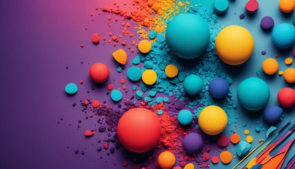
In the realm of color manipulation, there is a key element that can greatly influence the impact of your design: saturation. Saturation refers to the intensity or purity of a color, and it plays a crucial role in creating visual impact and evoking emotional responses.
When it comes to fine-tuning hues for maximum impact, understanding the subtleties of saturation is essential. By adjusting the saturation levels of different hues, you can create a compelling design that captures attention and elicits the desired emotional response from your audience.
Let’s take a closer look at how saturation can be manipulated to enhance your design:
“Saturation is like adding spices to a dish – it can bring out the flavors and make the experience more vibrant and engaging.”
Creating Visual Impact
One of the main advantages of manipulating saturation is the ability to create visual impact. By increasing the saturation of a particular hue, you can make it more vibrant and eye-catching. This can help draw attention to specific elements of your design, such as call-to-action buttons or important messages.
On the other hand, decreasing the saturation can create a more subdued and calming effect. This can be particularly useful when you want to convey a sense of tranquility or relaxation in your design.
Enhancing Emotional Response
Saturation also plays a significant role in evoking emotional responses from your audience. Bright, highly saturated colors are often associated with energy, excitement, and passion. Using these colors strategically can help create a sense of urgency or enthusiasm within your design.
Conversely, desaturated colors can convey a more somber or introspective mood. By tweaking the saturation levels, you can fine-tune the emotional impact of your design and elicit specific feelings from your audience.
An Image to Illustrate Saturation
To further illustrate the concept of saturation, take a look at the image below:

A Summary of the Subtleties of Saturation
Understanding the subtleties of saturation empowers you to create designs that leave a lasting impact on your audience. By fine-tuning hues and manipulating saturation levels, you can enhance the visual appeal and emotional resonance of your designs. Experiment with different saturation levels to find the perfect balance that aligns with your brand identity and elicits the desired response from your users.
Using Colour to Create a User-Friendly Website Environment
Navigating with Colour Cues
Colour cues play a significant role in creating a user-friendly website environment. By using strategic colour choices, you can guide users through your website and enhance their overall experience.
One way to utilize colour cues is by incorporating distinct colours for different sections or categories on your website. This helps users easily identify and navigate to the content they are looking for. For example, you can use a warm colour palette for product pages and a cool colour palette for informational pages.
In addition to differentiating sections, you can use colour to highlight important elements such as buttons or links. By selecting a contrasting or vibrant colour for these elements, you draw attention to them and encourage user interaction. This improves the overall usability of your website and makes it more user-friendly.
To further improve navigation, consider using colour in conjunction with visual cues such as icons or arrows. This combination provides a clear and intuitive path for users to follow, enhancing their ability to explore your website and find the information they need.
Colour and Accessibility: Ensuring Universal Usability
When designing your website’s colour scheme, it’s crucial to consider accessibility to ensure universal usability. Accessibility refers to creating an inclusive environment that accommodates users of all abilities, including those with visual impairments or colour deficiencies.
One key aspect of colour accessibility is contrast. Ensure there is sufficient contrast between text and background colours to make the content easily readable. Low contrast can cause readability issues, especially for individuals with visual impairments. Use tools and guidelines, like the Web Content Accessibility Guidelines (WCAG), to determine appropriate contrast ratios.
Another consideration is colour palette choices. Avoid relying solely on colour to convey important information. For example, if you use colour to indicate error messages, also include text or symbols to communicate the same information. This ensures that users who may have difficulty perceiving colour can still comprehend the message.
Lastly, test your website with accessibility tools to identify any potential issues. These tools can simulate different types of colour vision deficiencies or provide insights on readability. By addressing accessibility concerns, you create a more user-friendly environment that caters to a wider audience.
To summarize, by leveraging colour cues for navigation and ensuring accessibility, you can create a user-friendly website environment that enhances user experience and encourages engagement. Consider the impact of colours strategically, design with accessibility in mind, and provide clear visual cues to guide users through your website.
Colour Psychology in Call-to-Action Buttons
When it comes to designing a website that drives conversions, every element plays a crucial role. One element that often goes overlooked but holds immense power is the call-to-action (CTA) button. A well-designed CTA button can significantly impact user engagement and conversions. Did you know that the colour of your CTA button can have a psychological effect on your users?
Colour psychology plays a vital role in influencing human emotions and behavior. Different colours evoke different feelings and associations. By carefully selecting the right colour for your CTA button, you can effectively guide your users towards taking the desired action and increase your conversion rate.
“Colour is a power which directly influences the soul.” – Wassily Kandinsky
Let’s take a closer look at how different colours can impact user engagement and conversions:
1. Red – Urgency and Action
Red is a bold and attention-grabbing colour that signifies urgency and action. It can create a sense of excitement and motivate users to take immediate action. When used as the colour of your CTA button, it can effectively grab attention and prompt users to click.
2. Green – Trust and Safety
Green is often associated with nature and symbolizes growth and harmony. It is also commonly associated with trust and safety. When used in CTA buttons, green can create a sense of confidence and trust, encouraging users to proceed with the desired action.
3. Blue – Trust and Stability
Blue is a calming and soothing colour that is often associated with trust and stability. It conveys a sense of professionalism and reliability. When used in CTA buttons, blue can instill trust in users, making them more likely to click and proceed.
4. Orange – Energy and Creativity
Orange is a vibrant and energetic colour that evokes feelings of enthusiasm and creativity. It can create a sense of excitement and draw attention. When used as the colour of your CTA button, orange can capture users’ interest and motivate them to take action.
It’s important to note that while these colour associations are widely recognized, the effectiveness of a CTA button also depends on its contrast with the surrounding elements and its visibility. A high-contrast CTA button that stands out from the rest of the webpage is more likely to catch users’ attention and result in higher conversions.
Redesigning with Colour: A/B Testing and Analytics Insights
When it comes to redesigning your website, the choice of colours can have a significant impact on user engagement and overall success. To make informed decisions about colour choices, it’s crucial to rely on data-driven strategies and insights obtained through A/B testing and analytics.
The Importance of Data-Driven Colour Choices
Redesigning your website with an informed understanding of colour psychology and user behaviour can lead to better engagement and conversions. However, instead of relying solely on personal preferences or subjective opinions, it’s essential to base your colour choices on data and analytics.
A/B testing is a powerful tool that allows you to compare the effectiveness of different colour variations. By creating two or more versions of your website with distinct colour schemes, you can measure the impact of each variation on user engagement, conversion rates, and overall performance. Through detailed analytics insights and metrics, you can identify which colours resonate most with your audience, drive the desired actions, and achieve the best results.
By analysing the data collected during A/B testing, you can uncover valuable insights about the preferences and behaviours of your target audience. This information can guide your colour choices and empower you to make informed decisions that align with your brand identity and resonate with your users.
Additionally, data-driven colour choices can help you avoid potential pitfalls and overcome biases. By relying on analytics insights, you can steer away from assumptions or stereotypes about certain colours and focus on what truly engages your audience. This approach ensures that your redesigned website communicates effectively, evokes the desired emotional responses, and creates a visually compelling user experience.
When to Pivot: Adapting Colour Strategies for Increased Engagement
While data-driven colour choices are invaluable in redesigning your website, it’s important to remain open to adaptation and evolution based on user feedback and changing trends. A successful redesign involves continuous monitoring and analysis of data to identify opportunities for improvement and increase user engagement.
If your analytics reveal that certain colour choices are not resonating with your audience or failing to drive the desired actions, it may be time to pivot your colour strategies. By adapting your colour palette to better align with user preferences and behavioural patterns, you can enhance engagement and optimize conversions.
When considering a pivot in your colour strategies, it’s crucial to rely on both qualitative and quantitative data. User feedback, surveys, and usability testing can provide valuable insights into the emotional responses and experiences elicited by different colours. Combining this qualitative feedback with quantitative metrics can help you make well-rounded decisions that drive meaningful engagement and achieve your goals.
Redesigning your website with data-driven colour choices and a willingness to adapt based on analytics insights is a powerful approach to creating an engaging user experience. By leveraging A/B testing and continuous analysis, you can optimize your website’s colour palette to increase engagement, conversions, and overall success.
Colour Trends in Web Design: What’s Resonating with Audiences Now
In today’s fast-paced digital world, staying up-to-date with the latest colour trends in web design is crucial to creating visually appealing and engaging websites that captivate audiences. Understanding audience preferences and leveraging colour psychology can make a significant impact on the visual appeal and success of your website. Let’s explore some of the current colour trends that are resonating with audiences and inspiring web designers.
One popular colour trend in web design is the use of vibrant and bold colours. Bright hues such as electric blues, vibrant oranges, and rich purples are being used to create visually stunning websites that capture attention and evoke a sense of energy and excitement. These bold colour choices can be particularly effective for brands targeting a younger audience or aiming to create a dynamic and modern image.
On the other hand, soft and muted colour palettes are also gaining popularity in web design. Pastel shades like millennial pink, soft blues, and gentle greens create a calming and soothing atmosphere, perfect for websites that prioritize a sense of tranquility and balance. These subtle colour choices can be particularly effective for wellness, lifestyle, or luxury brands.
Another emerging colour trend in web design is the use of gradients and duotones. Gradients add depth and dimension to websites, giving them a contemporary and stylish look. Web designers are experimenting with vibrant gradients that blend multiple colours seamlessly, creating a visually captivating experience. Duotones, on the other hand, involve the use of two contrasting colours to create a striking and bold visual impact.

It’s worth mentioning that while these colour trends are popular, it’s important to consider your target audience and brand identity when selecting colours for your website. Understanding your audience preferences and aligning your colour choices with your brand values can lead to a more resonant and engaging user experience.
“Your website’s colour palette should evoke the emotions and associations that align with your brand personality and values.” – Web Design Expert
By staying informed about current colour trends and incorporating them strategically into your web design, you can create a visually stunning and emotionally engaging website that captivates your audience’s attention and leaves a lasting impression.
- Experiment with bold and vibrant colours to create a sense of energy and excitement.
- Consider soft and muted colour palettes for a calming and soothing atmosphere.
- Explore gradients and duotones for a contemporary and striking visual impact.
- Align your colour choices with your target audience and brand identity.
Remember, the world of web design is constantly evolving, and colours play a vital role in shaping the user experience. Stay updated on the latest colour trends and find innovative ways to incorporate them to create a visually appealing and emotionally engaging website that resonates with your audience.
Conclusion: The Psychological Power of Colour in Web Design
In conclusion, understanding the psychological power of colour in web design is crucial for creating visually appealing and emotionally engaging websites. The impact of colour on human emotions and behaviour cannot be underestimated, and by harnessing the principles of colour psychology, web designers can create powerful user experiences.
Colour has the ability to evoke specific emotions and shape user perceptions. Warm tones like red and orange can create a sense of passion and energy, while cool tones like blue and green can bring about calmness and relaxation. By strategically using colours that align with your brand identity, you can elicit the desired emotional response from users and build a strong connection.
Furthermore, colour plays a significant role in driving conversions and user engagement. By selecting the right colours for call-to-action buttons and employing conversion-focused colour schemes, you can optimize your website’s effectiveness in prompting desired actions. Additionally, A/B testing and data-driven colour choices allow you to refine and adapt your colour strategies for increased user engagement.
As you embark on your own web design projects, remember the power of colour. Consider the preferences of your target audience, craft a colourful user experience that aligns with your brand, and leverage the psychology of colours to create a website that not only looks visually stunning but also resonates with your users on an emotional level.

